Fone King
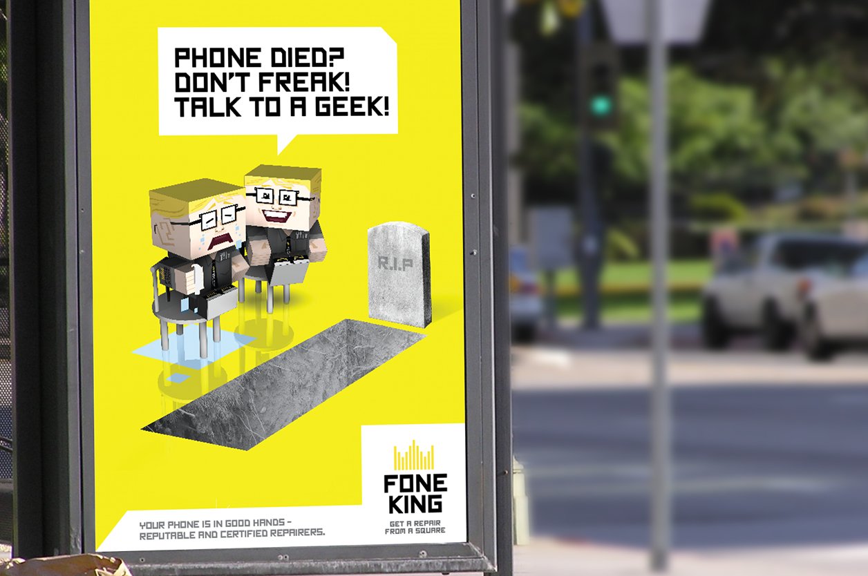
Problem: Fone King had a basic logo and colour palette, but was looking to add more brand assets to bring their brand to life across outdoor and touch-points within store to make the brand memorable and fun.
Background: We developed the idea of ‘get a repair from a square’, playing into the FK brand’s square shaped logo-type, making geeks cool and developing a distinctive character based off of this. We used this character throughout the collateral and outdoor campaigns.
Skills used: Concept design, illustration, posters, brand collateral design, retouching, ideation.


